TidyTuesday 2025/08/12
Today's topic is something that I am very passionate about and I know that many other scientists, as well as young people are too: climate change. Today's dataset comes from Carbon Brief, click here to read the original post and dataset.
It specifically asks the question: are extreme weather events linked to human caused climate change? To answer it, the author of the dataset compiled 700+ studies which analyzed climate events and trends. The dataset contains a series of key parameters (e.g. event type, where and when, etc) but also whether the authors deemed that this kind of events are can be attributed to climate change and whether other events of this kind are more likely to happen.
Overall, the conclusion is that extreme climate events are more likely to occur in the future as a consequence of human activity, but there is some nuance to the data
Let's dig right in!
The main analysis
Due to the high amount of discrete data, which was easily classified into few subgroups, I was feeling in a geom_tile() and facet_wrap() mood today. The first plot shows a homemade dumbbell graph of all events in the dataset, grouped by their type, with the duration of the event showcased by the segment. I highlighted of interest certain events with large duration. This graph does not include trends, which are more abstract climate anomalies (such as 'flooding' or 'global rainfall extremes' or 'Western US wildfires', i.e., anything that is not linked to a specific time and place, although if you ask me, the dataset probably collected the wording used by the authors, while the actual difference between events and trends may be more nuanced than I can pick apart).
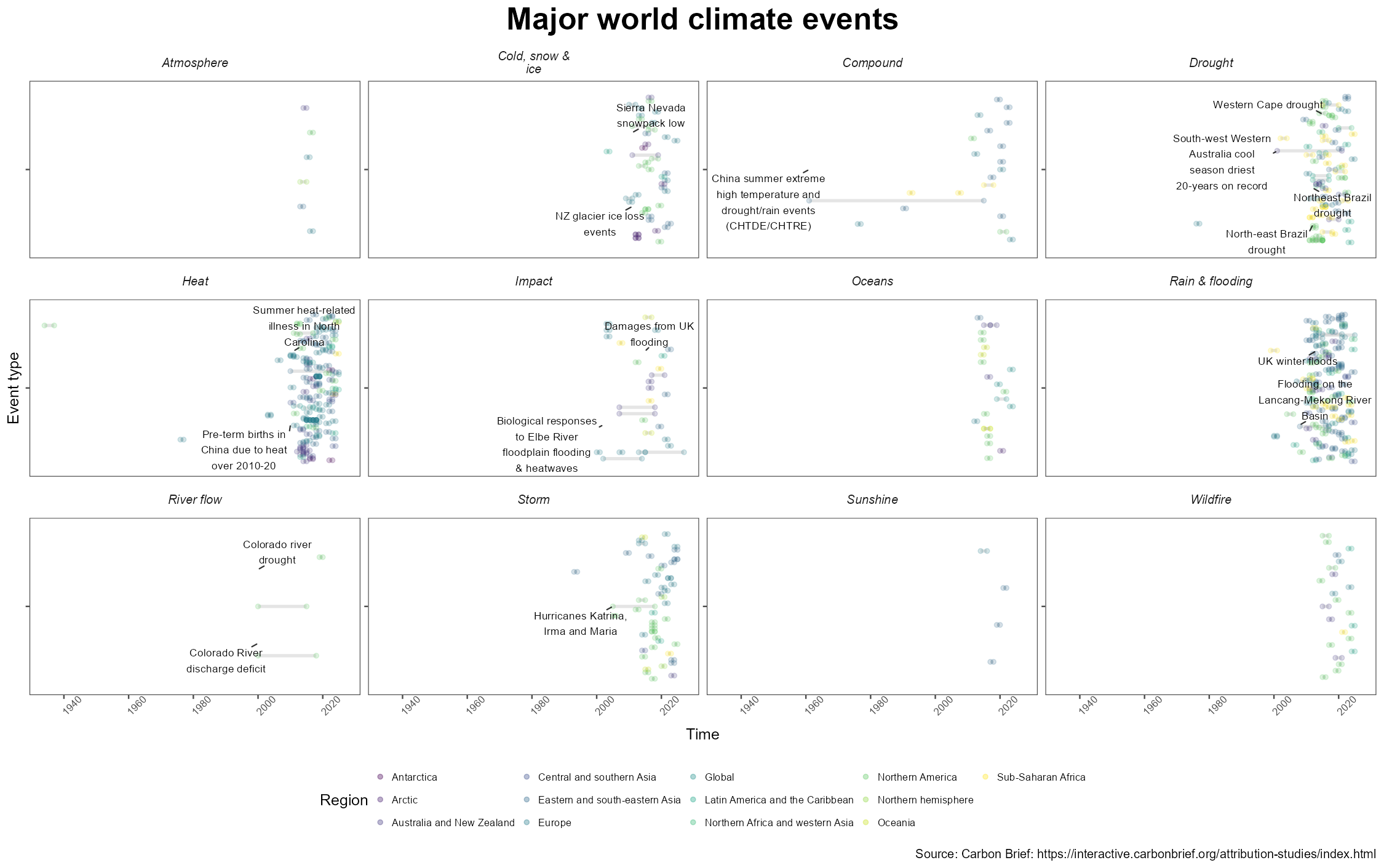 Overall, we can see that heat, drought, and rain and flooding are the most studies events, followed by storms and wildfires. As is expected (thanks to firefighters! As a Spanish person, firefighters will always have my gratitude) wildfires are not long lasting, while droughts have the longest lasting events.
Quirkier names, such as sunshine refer to changes in levels of solar radiation, and impact refers to mortality, bleaching, economic damages, etc.
A clear trend seen here is the explosion of studies after the 2000s, this could be linked to increased ecological consciousness after Y2K but also to easier access to studies published then, likely a consequence of both.
The code to share and learn that was new this time around is the pipe:
  clean_events <- events %>%
    mutate(
      event_year = ifelse(is.na(event_year),
                          event_period,
                          event_year),
      event_year = str_replace(event_year, ", ", "-"),
      event_year = str_extract(event_year, "[0-9-]+")
    ) %>%
    separate_wider_delim(., event_year, delim = '-',
                         names = c("start_year", "end_year"),
                         too_few = 'align_start') %>%
    mutate(
      end_year = ifelse(
        is.na(end_year),
        start_year, end_year
      ),
      start_year = ifelse(
        start_year == '',
        NA, start_year
      ),
      start_year = ifelse(
        is.na(start_year),
        end_year, start_year
      ),
      start_date = ymd(paste0(start_year, "-01-01")),
      end_date = ymd(paste0(end_year, "-12-31")),
      period = as.period(interval(start_date, end_date))
      #learned the as.period and interval functions

    )
I was happy with this solution that handles weird formatting from the dataset.
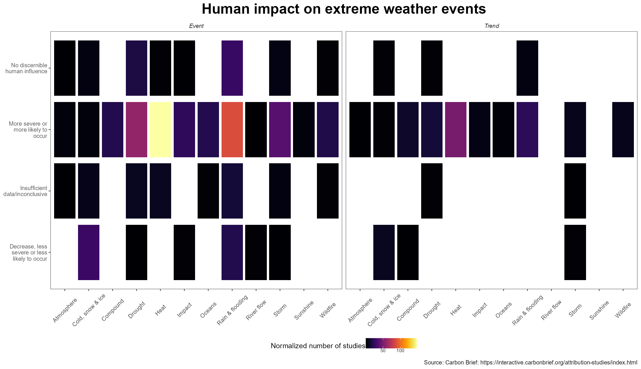
A quick look at which kind of events are deemed by researchers as more or less likely to occur due to anthropogenic climate change reveals that:
and a simplified version
 This showcases that for both events and trends, heat and drought related have been attributed more times to climate change than others, and not a single time they have been deemed less likely to occur due to climate change. On the other hand, cold and snow events do appear to be more attributed to occur more often, revealing a worrying trend in overall warming of our planet. Results seem a little more inconclusive in other classifications, such as atmosphere and storm.
A map!
As I wrote last time I wanted to use a map a little more seriously, so I made this (still simple) one:
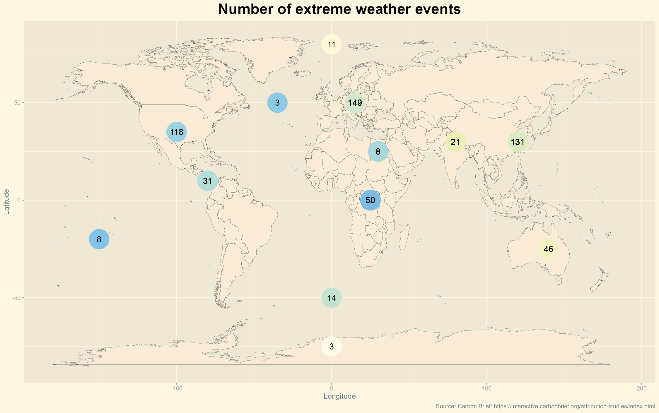 This one shows a world map with the number of climate anomaly events for each part of the world where studies were conducted, which highlights the bias of research: countries with more resources can afford to make more studies in this field. The most likely explanation for this trend is not that there are more extreme events in Europe or North America, but rather that more studies are conducted there.
PS. I had to hard code the lats and longs for the geom_points() - I also wanted to color code each country by # of studies but found it impossible to do it other than by hand due to discrepancy in ISO codes provided by dataset and the country names provided in library(maps).
PLEASE if you know how to sort this out email me.
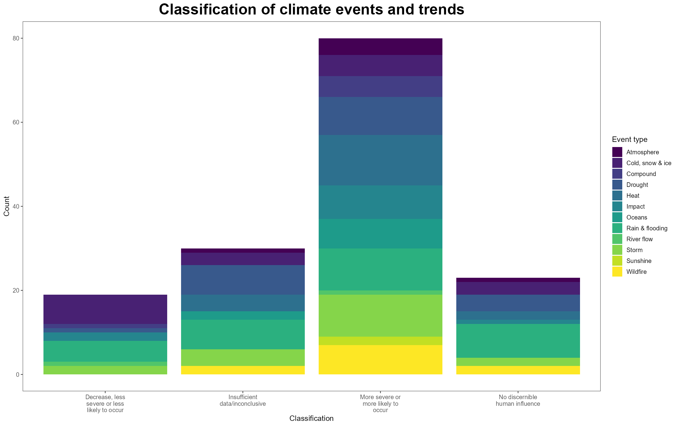
I was also curious as to how we can combine the map and the previous tile graph to determine whether certain areas are deemed more vulnerable to some kinds of climate events.
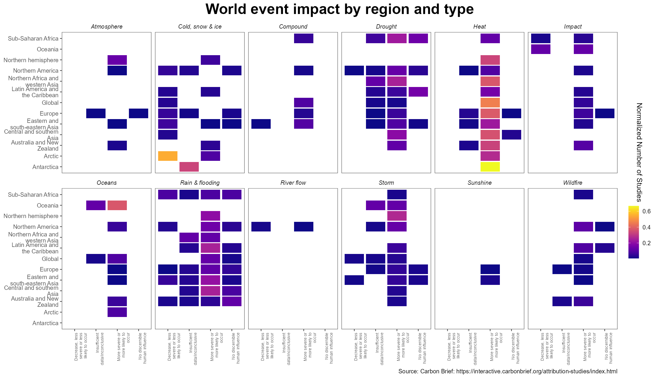
There is a lot to digest here, so let's take a few conclusions. I encourage you to look at the graph carefully by yourself.
- Here, I normalized for how many studies for a given region are for a certain kind of event type and classification
- Antarctica is affected by heat-related events caused by climate change, and the impact of climate change on its cold and snow events is unclear, but it is clear that in the Arctic, there is agreement that cold and snow events are less likely to occur
- Globally, heat events are more likely to occur and will not decrease anywhere.
- Rainfall and flooding is a little less clear, as some studies attribute lower rainfall and others attribute higher rainfall to climate change. It is likely that rainfall extremes are attributable to climate change, but this is speculation based on this data.
Finally, an interesting metric in the dataset was 'rapid_study', in other words, whether the study is done immediately following the event. The response, overwhelmingly, is that events are not studied rapidly (within days) after the event occurred.
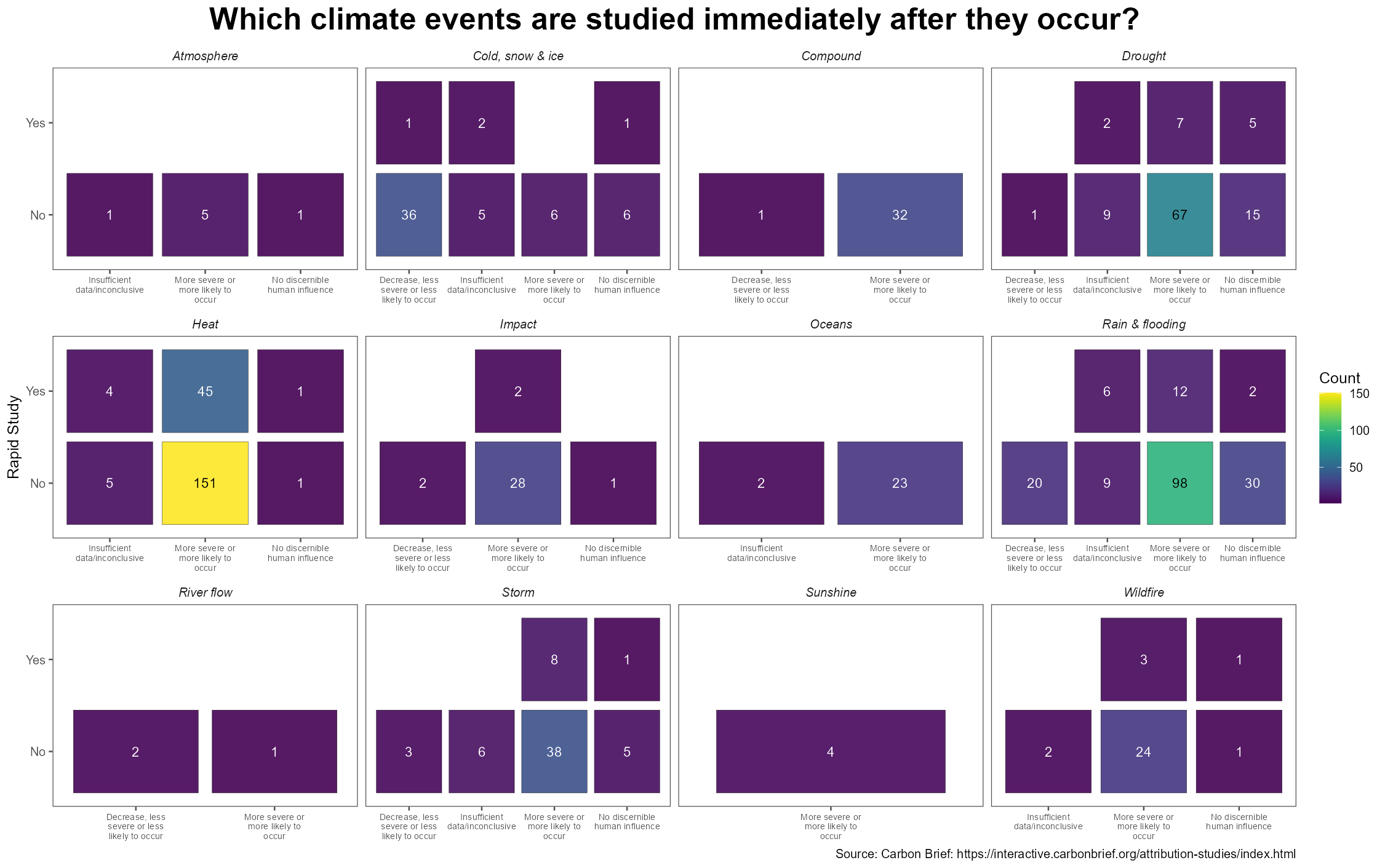
This shows that heat events are studies immediately after, but I found a worrying lack of quick follow up studies of Rainfall and flooding and wildfire, especially given the acute nature of these events (such as the tragic summer wildfires currently going on here or the 4th of July Central Texas floods).
The scientific community could use this as a way to direct efforts: perhaps more could be done to respond to these events if we are able to study them immediately after they occur, but I understand how this can be insensitive to those affected.
Overall, this was an eye opening and interesting dataset which I enjoyed working on due to the high amount of string and discrete data which let me practice my stringr skills. It is sad to see the results shown but I believe they can help people realize the severity of what we face in the future.
Until next time, best of luck