TidyTuesday 2025/08/05
Happy inaugural blog post!
Something you will probably end up figuring out about me, if you somehow find this blog and decide that you wish to keep reading my writings, is that I am someone who enjoys digging into a topic for several weeks or months at a time, and then letting it go. This is often cyclical, as is the case with Magic the Gathering or Dungeons and Dragons, other times this has yet to come back (brief 1 1/2 year Muay Thai stint 2 years ago). The only topic I have not bored of is, of course, science. Powerlifting lasted an incredible 5 years. The more that I get into science, the more I realize that my initial reticence at 'dry lab' stuff and almost an (appalling, in retrospect) disdain for bioinformaticians and data analysts stemmed likely from my inability to perform these tasks myself. Decidedly, I chose to undertake the task of learning R and learn a basis of statistics for a few reasons:
- Perform my own, reproducible, and shareable data analysis
- Create beautiful graphs
- Expand my marketability beyond a wet-lab hyperspecialist
- Learn something and minimize my reliance on LLMs
- Enhance my writing and defensibility of chosen analyses
No mean feat! I know that I love to learn by doing. TidyTuesday inspired me to do this via mini-projects, which take me around 3-4 hours each week. I think this makes it digestible and more easy to stick to - this blog is a way to keep me accountable and learning too.
My objective is to not only practice data wrangling and visualization skills but also learn a new R technique/command each week, as well as improve my data story telling. I apologize in advance if the code is inexpertly written or if my 'revelations' are child's play to some readers. Let's get right to it!
TidyTuesday 2025/08/05 - Income Inequality Before and After Taxes
Please find all sources for the data in the original GitHub link from TT
Disclaimer: Please note the dataset presented does not reflect in any way my personal views or affiliations
Context: how is income distributed? The question of income of a population and how/whether to distribute has long been studied. The dataset provided to us earlier this week contained historical population data alongside the GINI index.
The GINI index is a measure of income inequality.
I found it worthwhile to read a little into exactly what the GINI index is. A brief reading on Wikipedia defines the GINI index as defined by the Lorenz Curve. This Lorenz Curve is a graph which describes what proportion of the population controls what proportion of the wealth:
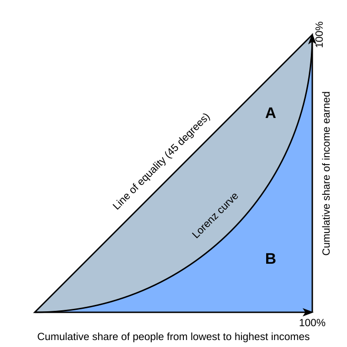
Thus, the more that a concentrated core of people control larger percent of the wealth, the more inflexed the Lorenz Curve is. The area under the curve is marked as B. The area A represents the 'jump' that a current population would need to undertake to reach an idealized completely equally distributed - where every person controls a share of the wealth proportional to their proportion in the population. Thus, GINI is defined as:
GINI = A / (A + B)
It is a description of the inflexion of this curve. The higher GINI is, the more of a jump the population has to make - the further away it is from an idealized distribution. A GINI index of 1 would be an infinitesimally small proportion containing all the wealth while an index of 0 would be a perfectly even distribution. The dataset given reports 2 variants of the GINI index: 'pre-tax' (market) and 'post-tax' (disposable household income, also includes not just taxation but also government help and subsidies that are both given to and received from the government).
The higher GINI is, the more uneven wealth distribution.
First analysis
The first thing that I did was simply to plot population growth graphs out of curiosity for continents and countries I was interested in.
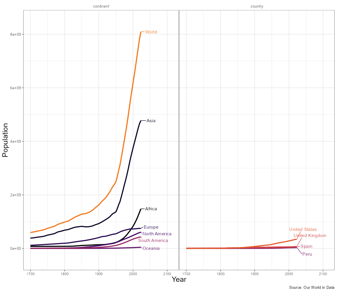
Figure 1
My next graph was to map out the latest post-tax GINI indices in the map of the world
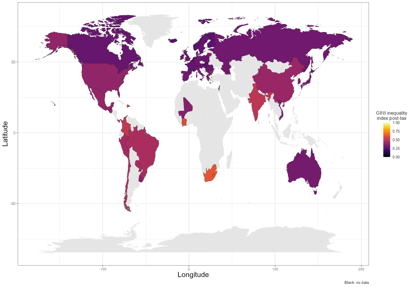
Figure 2
This approach was done with the following code:
    library(maps)
    world = map_data("world")

    world <- world %>%
      mutate(
        region = case_when(
          region == 'USA' ~ "United States",
          region == 'UK' ~ 'United Kingdom',
          region == 'Ivory Coast' ~ 'Cote d\'Ivoire',
          TRUE ~ region
        )
      )
    #this was done to allow merging of the databases for
    #superposition of countries in the map
    inequality_change_map_df <- left_join(world,
                                    income_inequality_processed_cleaned,
                                    by = 'region')

    inequality_change_map_df <- inequality_change_map_df %>%
      group_by(region) %>%
      filter(!is.na(gini_dhi_eq)) %>%
      slice_max(order_by = year, n = 1)
    #choose only the last value of post-tax gini
  ggplot() +
  geom_polygon(data = world,
              aes(x = long,y = lat, group = group),
              fill = 'gray90') +
  geom_polygon(data = inequality_change_map_df,
              aes(x = long,y = lat, group = group, fill = gini_dhi_eq),
              color = 'black', linewidth = 0.1) +
    ...
I learnt that the maps package existed and how to access it for rudimentary map usage and plotting. In the future, I want to use a map more seriously.
These results offer a good snapshot at the world. The map easily highlighted countries with high inequality: South Africa, Colombia, and Ivory Coast stood out to me particularly.
Second analysis: GINI over time
How has GINI changed over time? This was a question I thought was interesting. I first plotted the GINI pre- and post-tax.
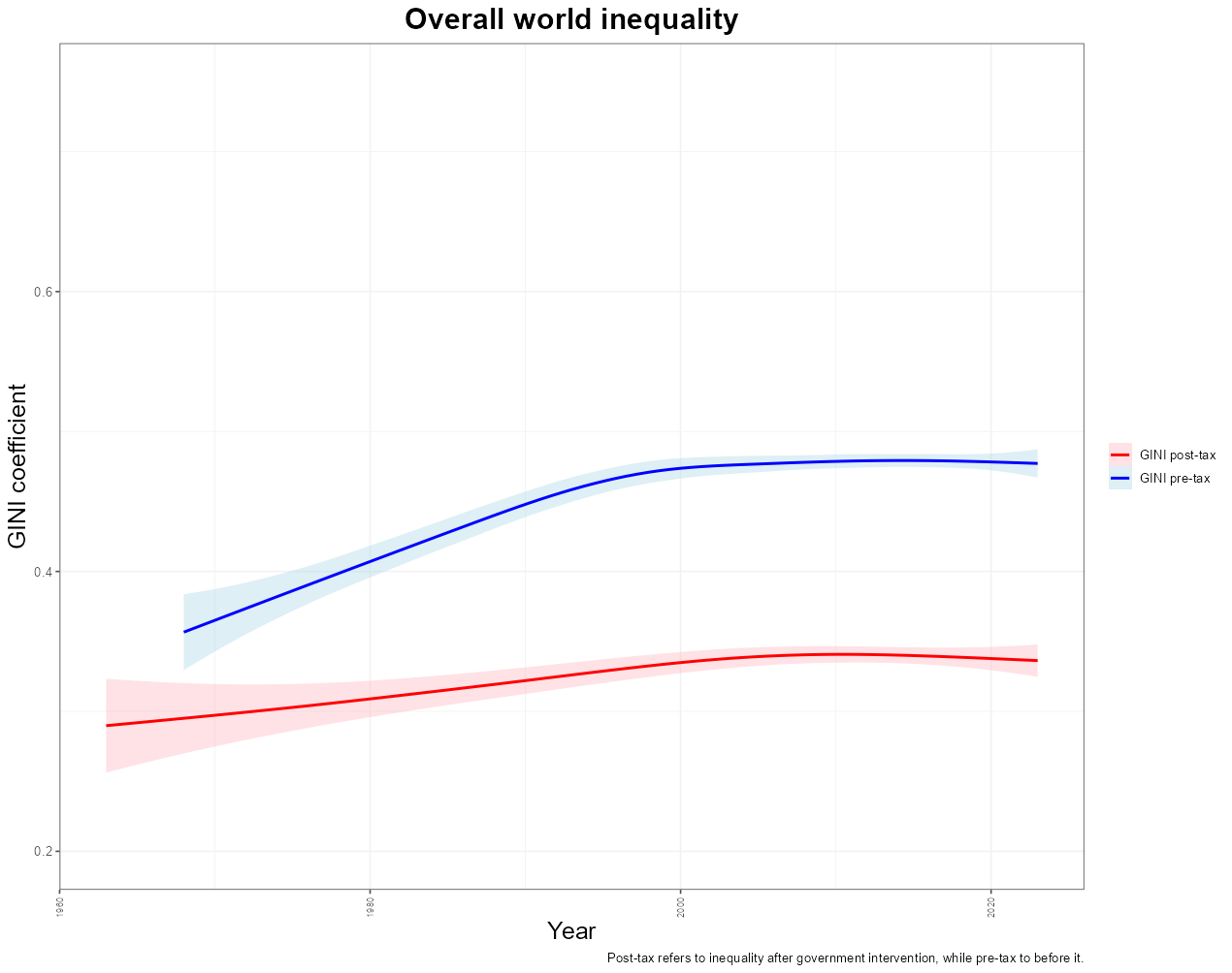
Figure 3
This graph shows the overall world tendency for the GINI index (for the available n = 59 countries). Overall, it seems that pre-tax income inequality has increased since the 1970s by an increase of almost 0.1 (25% increase from 0.4). However, we must bear in mind that this reflects the inclusion of data of other countries - not all countries' data was available as early as the 1970s as we will see below. This may instead reflect simply the addition of countries with high GINI indices (such as those mentioned above) allowing the mean to flatten out.
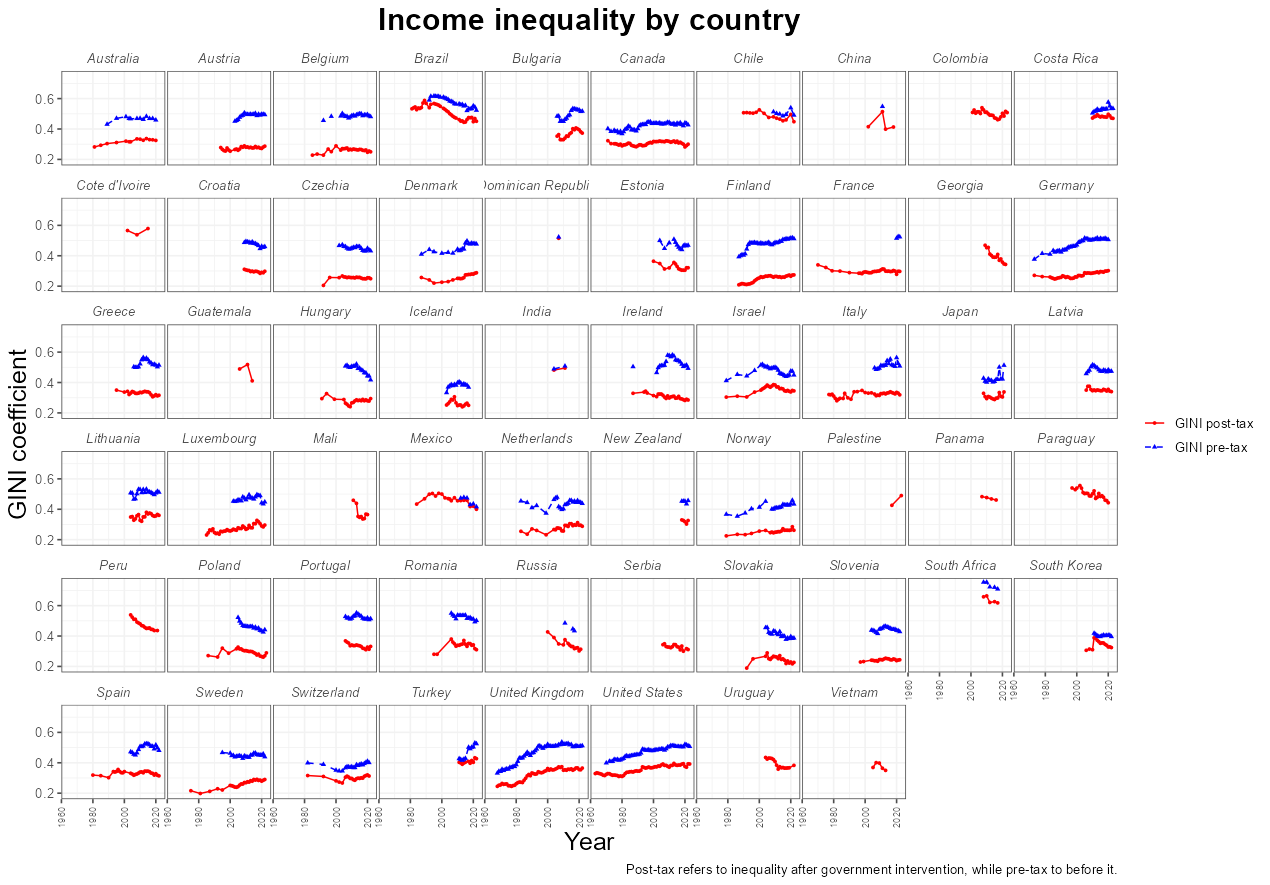
Figure 4
On the other hand, if we look at the data country-by-country, we can see that there is possibly the two effects playing a role:
- Countries such as the United States, the United Kingdom, Norway, Finland, and to a lesser extent, Canada, all trend upwards in the pre-tax (blue lines). The trend persists in the post-tax (red lines), although (qualitatively) it appears to be to a lesser degree.
- Countries like Brazil and Costa Rice increase the mean trend, especially around the 2000s
- The UK's rapid increase in GINI in the 1980s coincides with the Iron Lady's Prime Minister tenure (1979-90)
- Turkey's missing 2016 data point and subsequent increase in GINI coincides with the 2016 failed Coup attempt by Gülenists, which I did not know had occurred until time of writing
- The Finnish depression of 1990s (unemployment raised from 3.5% to 18.9%), caused by economic bubbles, the collapse of the USSR, and, interestingly, an overreliance on paper production, also coincides with an increase in GINI.
        gini_by_age <- rbind(gini_by_age_1, gini_by_age_2) %>%
        group_by(region) %>%
          mutate(
            redistribution = gini_mi_eq - gini_dhi_eq,
            current_redistribution = last(redistribution),
            original_redistribution = first(redistribution)
        ) %>% ungroup() %>%
        arrange(region, desc(year), desc(gini_mi_eq)) %>%
          group_by(region) %>%
          distinct(year, .keep_all =  TRUE)
        #this taught me to use arrange and distinct with the .keep_all call
        #to get rid of datapoints which were duplicated in both datasets
        #note that the raw dataset underestimated some observations substantially
        #(esp. Finland) which is why I think this merging / removing can be done
        #2 dfs in rbind are the cleaned up processed and raw respectively
The next thing to look at was - the difference between pre- and post-tax GINI index. This is what I labelled as redistribution and calculated it as:
GINI pre-tax - GINI post-tax
It is interesting to note that (see Figure 4) many countries have similar pre-tax GINI indices, but they are substantially different in their post-tax indices (e.g. compare the USA with Germany). This gives us an indication of how much the goverment intervenes in the economy. As the author of the original dataset puts it:
While the change in inequality before and after tax gives us a measure of the extent of government redistribution, it does not tell us the total reduction in inequality caused by this redistribution.
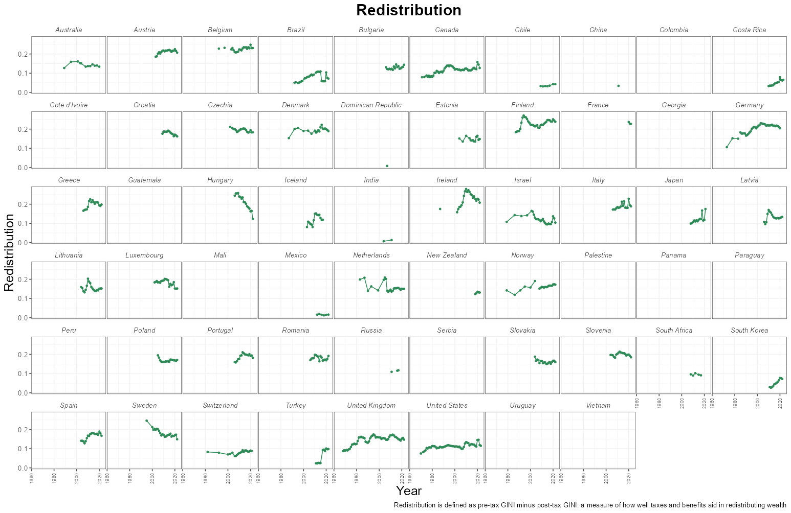
Figure 5
Belgium, Austria, Germany, and Finland seem to be some countries with the highest redistribution metrics. The United States shows a peak in redistribution which coincides with President Biden's term in office and the COVID 19 pandemic.
Finally, I simply looked at what the raw value of the change has been for countries in GINI pre- and post-tax since they first started reporting them.
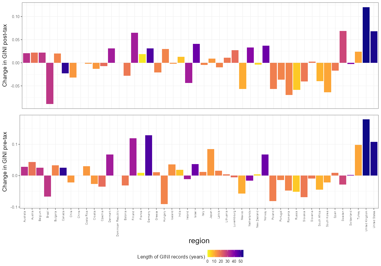
Figure 6
Once more bearing in mind the age of the data (here especially highlighted by the color), we can see that the UK is the country which has had a largest increase in GINI pre- and post-tax while Brazil has shown the largest decrease in both metrics! Others, like Germany or Japan, have greatly increased pre-tax GINI but redistribution has kept GINI post-tax lower.
It is worth finishing off by stressing that there are a lot of factors into how GINI is calculated and is produced and it is a simplification to take any of the data here presented and make sweeping conclusions about methods of governance or economics. To find out more about GINI, the data, and how to properly interpret it, I suggest you go into the original post and references therein.
That's all for this post. Until the next one, best of luck.